Federation Square Wayfinding
The style of the sign designs are based on the architecture of Federation Square as well as trying to create a contemporary and classy design. The typography is quite contemporary, Hypatia Sans Pro semibold and black. The colours are quite high contrast and stands out against the brown, bluey-greys and glass that reflects the blue of the sky. Over all it is simple, geometric and very clean.
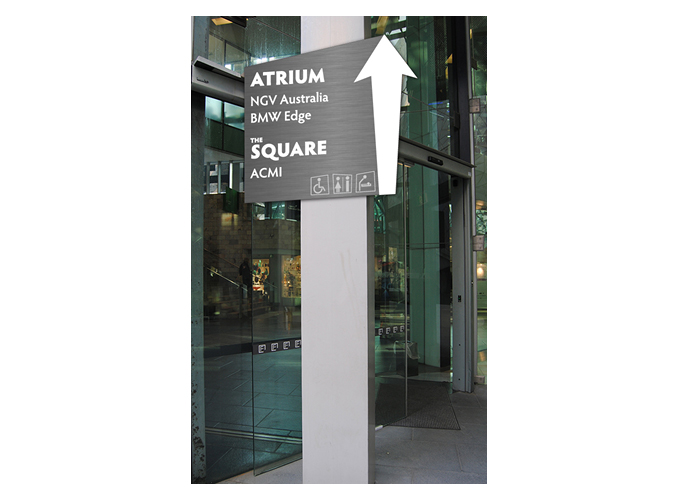
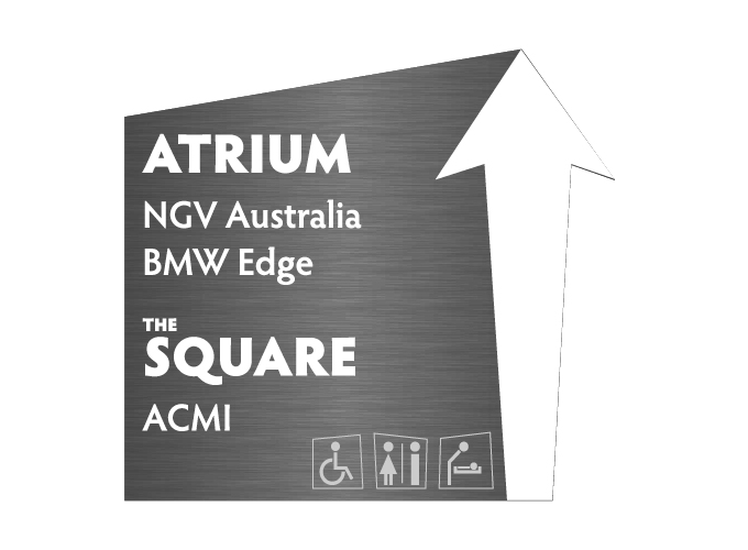
Wayfinding sign 1
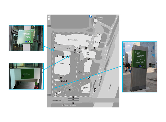
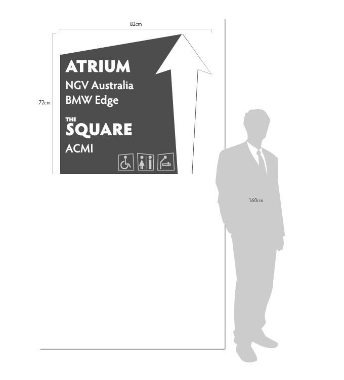
This signage solution is a wall-mounted sign that will be placed slightly above head height (the top reaching roughly up to 200cm) mounted on a wall, or as the original sign is, mounted on a pole/post. The signage is roughly 82cm by 72cm. The signage will be located at the entrance to the Atrium, listing the places inside the Atrium and then the locations beyond - at the Square.
Wayfinding Sign 2
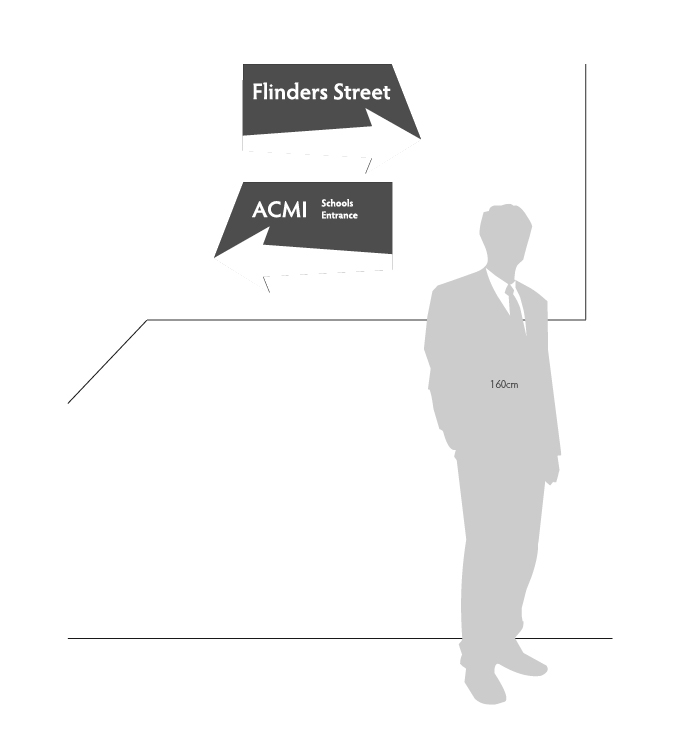
This signage solution is a wall-mounted sign that will be placed above head height (the top reaching roughly up to 220cm from the steps directly below) mounted on a wall above the stairwell at an exit towards Flinders Street, or as the original sign is, mounted on a pole/post. Each of the two individual signs are roughly 40cm by 50cm. The signage will be located at the exit towards Flinders Street, with the ACMI schools entrance on the left.
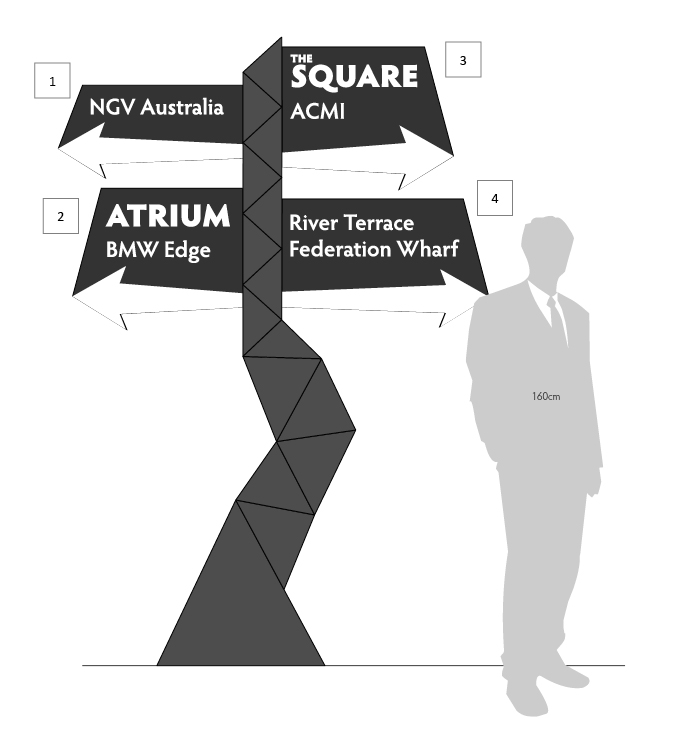
Wayfinding Sign 3
This signage solution is a signpost design that will reach up to 220cm. It is free standing but permanent. The four different signs are all roughly 50cm by 50cm. The signage will be located on the corner of Flinders and Swanston streets. The signs will be representative in the direction they are pointing to the locations they are indicating.

Top Down View
This top down view illustrates that the signs will be pointing towards the locations they are indicating. This means the signs will be more representative so the user understands the direction they need to be heading to reach their destination. This should allow for easier wayfinding.
Materials
The materials to be used will be a dark brushed steel with engraving, and white paint filling the engraved type and arrow. The toilet, disabled and baby-change symbols will have a light grey paint to create a subtle hierarchy. The materials need to be able to provide a sturdy and partially vandalism-proof surface. It needs to have a high visibility in a variety of lighting and weather conditions. Due to the requirements, stainless steel is more durable than other materials and highly weatherproof. The brushed metal should not be reflective and provide a good contrast to the engraved letters. The extra depth provided by the engraving will make the letters more visible from a wider range of angles. If the signs are defaced - spray paint, adhesive stickers, etc - stainless steel is easy to clean and maintain.