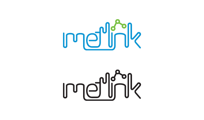
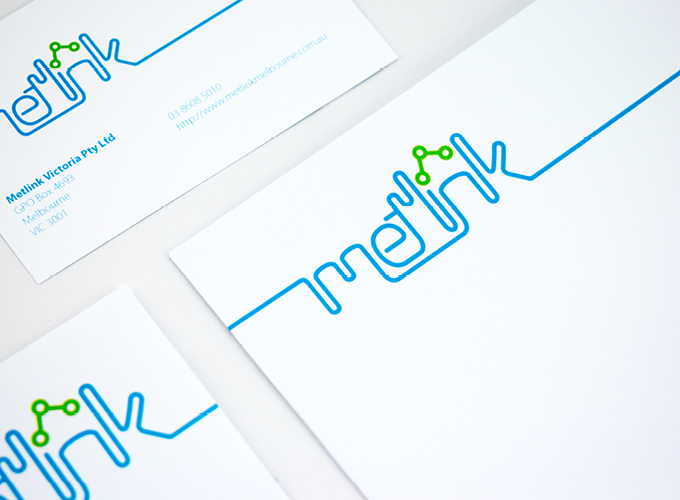
Metlink Brand Identity
This logotype first and foremost represents how Metlink connects people. The typography is linked together to create what can be perceived as either a smooth journey or tracks around a city. It also serves as a reminder of the ‘link’ in ‘Metlink’.
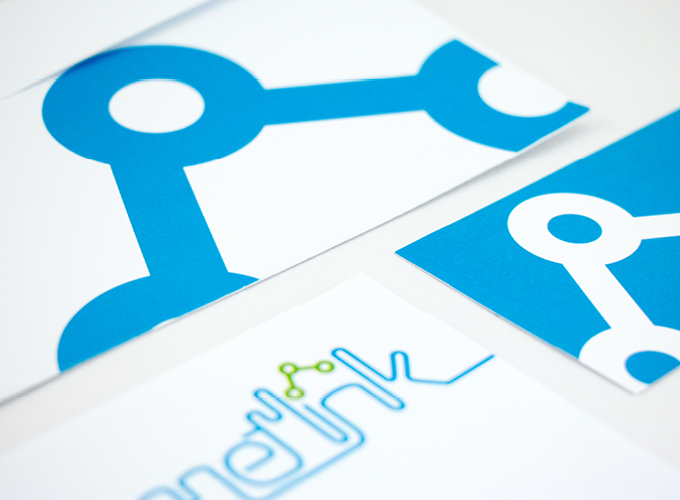
The three connected circles above the ‘i’ represent the three modes of transport supplied by Metlink, they are connected to illustrate how the three services work together to transport people.
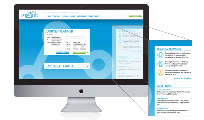
Sidebar fades in and out which features livefeeds of latest news and service alternations.
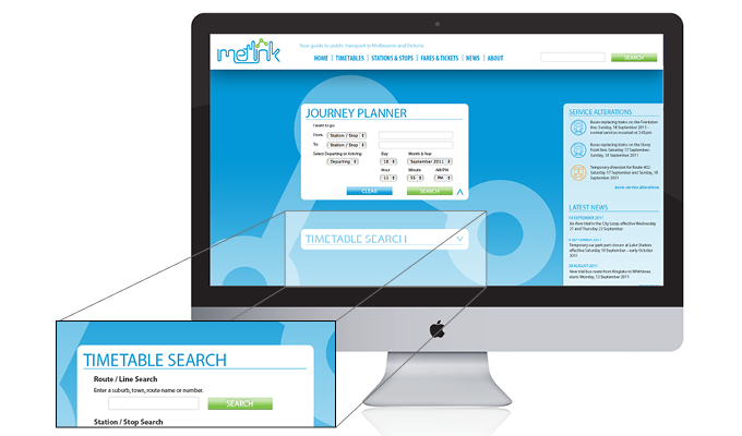
Expanding modules for search and planning tools.