Respawn Magazine
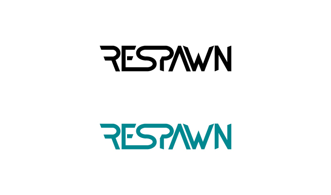
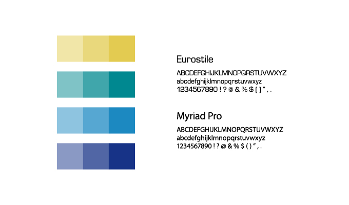
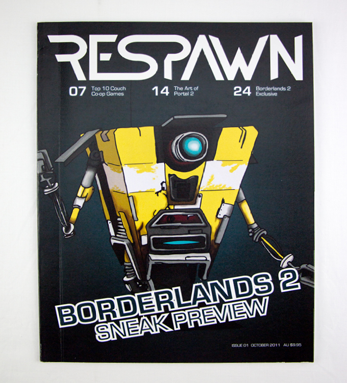
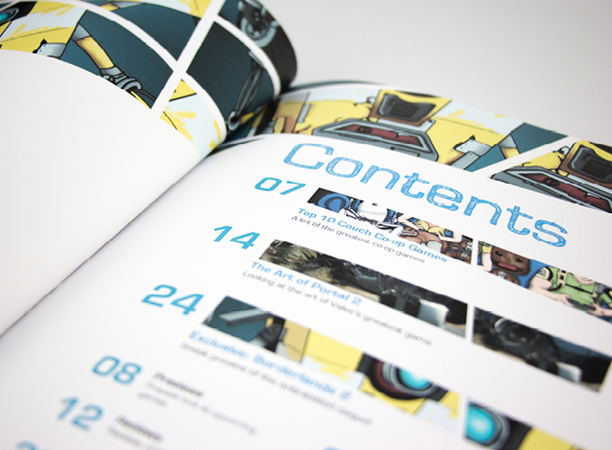
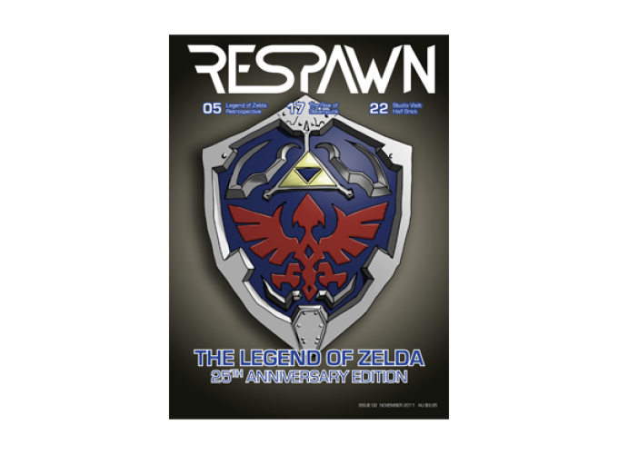
The title - ‘Respawn’ - is a gaming term, it is the recreation of a character after it’s demise or death. I used Eurostile - a very square typeface to reflect 8-bit graphics and TV or computer screens - for titles and subtitles. The way I have separated this magazine from it’s competitors is space. The content isn’t so cramped and the overall layout is much easier for reading and enjoying the articles. I would say the target audience is a mature gamer - roughly 21-30 male and female.