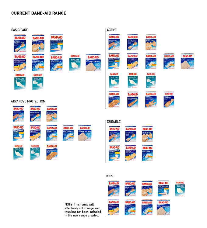
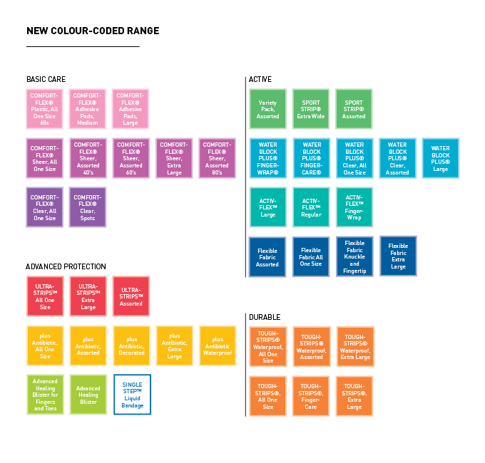
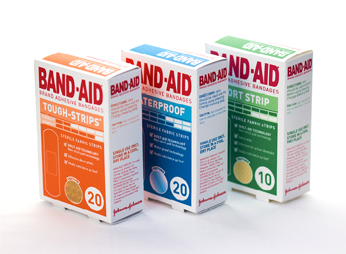
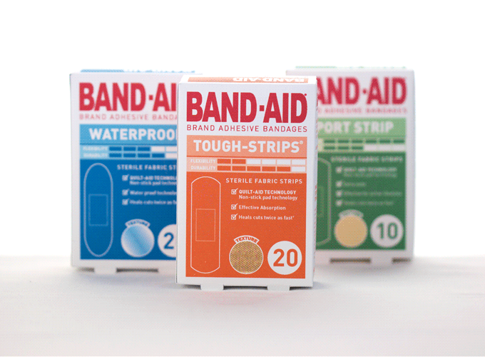
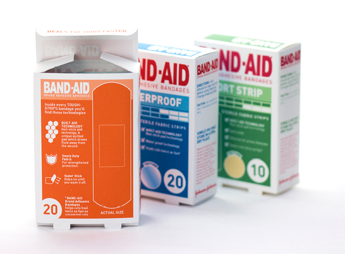
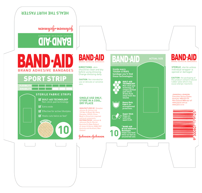
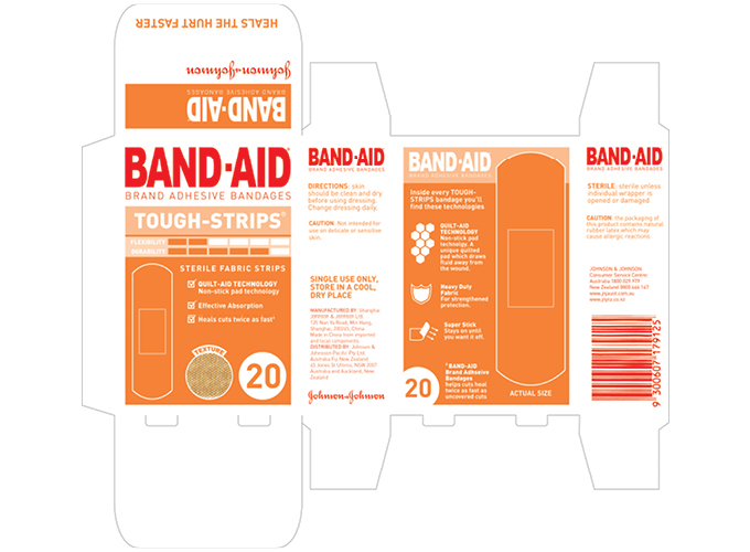
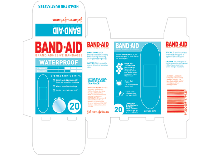
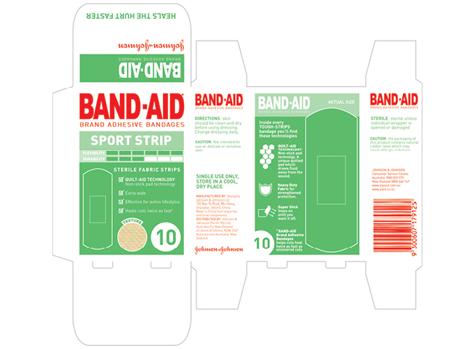
Band-aid Packaging Redesign
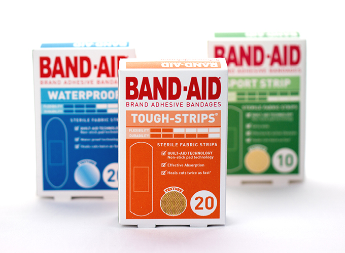
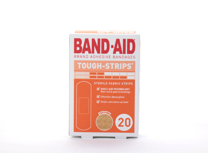
The style is minimalist using infographic style images to assist decision making. Key features are listed and comparable features are located in consistent places on the packaging. The explanation for each feature is confined to the back with the ‘actual size’ of the band-aid product. The approach is utilitarian, customers want to immediately understand the differences between the products on the shelf.
Furthermore the colour-coding should help people identify the different ranges on the shelf but also in their cupboards at home.