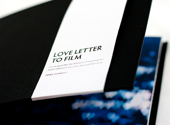
Love Letter to Film
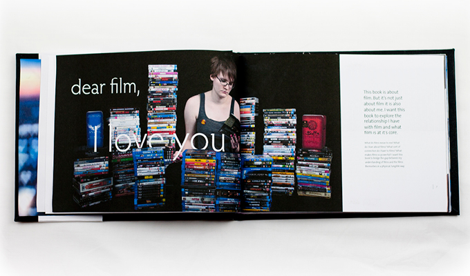
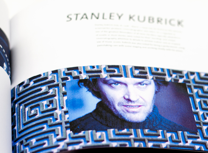
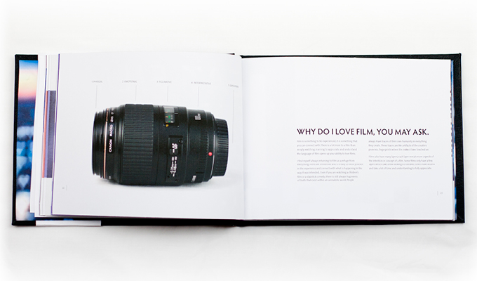
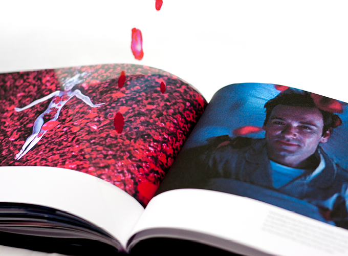
My design is very clean, focusing on the images and the words without any perfunctory decoration. The pacing was intended to be similar to that of a film - building towards the last third - but this made the beginning of the book too dull. The majority of images are photographs of films. It was difficult to create new imagery when the book is primarily about enjoying other people's work. This was not intended for commercial production - it is intended to be a personal work.